Webscraping with PowerBI
Hey all!
Today I’ll be showing you how you can use PowerBI to scrape the web for data without writing a single line of HTML or C#, or any web language - this will be webscraping PowerPlatform style! However, as well as that we will also take a look at dynamic web URL buttons, formatting tips and tricks, how to show image URLs in PowerBI, text filters and even how to make your PowerBI report look like a webpage.
This time I wanted to write up a little review of a viz I made recently. At Avanade I’ve started co-running a visualisation competition with the awesome Prathy Kamasani (if you haven’t seen her blog yet you should check it out). It’s not publicly available so if you want to join the fun, you will need to send a CV over to Avanade HR (the competition that is, Prathy’s blog definitely is publicly available!).
Anyway, the theme a couple months ago was visualising some fun data from the site Metacritic, specifically their list of the best of 2020, based on user ratings. As Prathy pointed out, most of us haven’t done much over the last year outside consuming media, so this was very on trend. The initial challenge covered films, games, music & TV, but as my schedule is pretty busy and I ended up creating the entire thing in a single evening, the day before, I chose to just focus on video games; considering it’s the main hobby other than messing around with data that helped me through lockdown!
One critique I got at the viz review session was that I didn’t show how I had done it - so let me right that wrong here. This is how I built this report.
Anyone who has been following my blogs will see I’m spending a lot of time in the internet / PBI integration space anyway, so I thought this would be a great chance to use some of those skills. But I’m also lazy and on a tight deadline, so I decided the best thing to do would be to simply replicate Metacritic in PowerBI. Now, there is a way you can literally just dump a webpage into a report, using the HTML viewer custom visual.
I found this awesome blog post by the driving force behind BI Elite, Parker Stevens (if you are reading this Parker, Hi!) about how we can take whole webpages into PowerBI. I was thinking of just having a slicer that would let you select the game you want to see more about, which in the background would change where the HTML viewer is pointing. Unfortunately, a limitation of the HTML viewer is that if a site has CORS restrictions (basically just restrictions on pulling content across domains) then it won’t work. So back to the drawing board.
My next idea was if I couldn’t just import it wholesale (which would have been a bit of a cop-out anyway) then the next best thing to do would be to just grab all the content on the site and then rebuild it in PowerBI. For anyone who saw my Wall Street Bets viz then you probably already know I think making stuff in PowerBI (or any other visualisation software) but making it look like you didn’t build it in PowerBI is a really good way to make your report stand out!
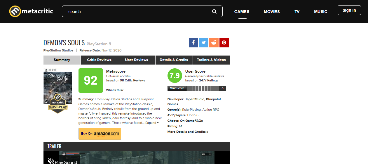
So at this point, let me show you an example of the metacritic page - this is the page for Demon Souls (the spiritual progenitor of the phenomal Dark Souls series), the game I would buy a PS5 for, if my partner would let me (built my own PC during lockdown - not allowed to spend more money on this for now, quite reasonably))
And here is my version (view it in fullscreen by clicking the little arrow icon on the bottom right, looks much better!)
You can scroll down to see more reviews, as well as change the selected game in the search bar. It doesn’t have my usual polish, so there’s quite a few visual headers still enabled, and I could have grabbed the user reviews too, and also done the same for movies, TV etc., but for a couple hours, not a bad effort.
So you may be wondering why this merits a blog post, and isn’t just in my gallery. The cool thing here is how I actually got this data in the first place (and then some bonus design stuff at the end!).
Microsoft released a new functionality for the web.contents connector about a year ago called Web by Example (Documentation). If you didn’t just click the documentation link, let me explain quickly - it’s basically a way to tell PowerBI what data you want from a webpage, by providing it some examples. Why is that cool? It’s because it means you can use PowerBI to scrape webpages for data which can be a huge time saver. If you like entering data competitions and things, it is a great way to supplement the original dataset, without needing to manually copy and paste a load of stuff into excel!
Just a note before we dive in on this, Microsoft have released some AI updates to this recently. This basically is just the AI trying to guess what tables you might want. I personally found this feature fairly hit and miss, and mostly leaning toward the miss, but it’s a nice feature nonetheless.
So, next up I’ll show you step by step how you can build a web scraper in PowerBI. Mine is setup for metacritic, but of course you’ll be able to use this on any site you want. One note of caution - as the connector needs to pull tables from the page, it does rely on websites being structured in a way it can understand, so some sites just don’t work very well with this. If the data you are after is on any kind of popup or just not visible on the initial view you might find it a little tricky.
You’ll also see in how I loop the query to pull multiple pages, you need a website that has a very formulaic URL convention, so that you can programmatically determine what URL you’ll need, otherwise you’d need to visit every page and copy the URL to create a list for the scraper, which would defeat the point of using it in the first place.
Webscraping
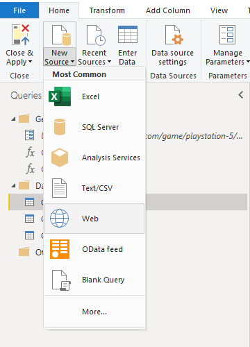
To get started we just jump into the PowerQuery Editor go to New Source and select Web. This is because we will be using the web connector in order to connect to metacritic.com.
We will now get a prompt asking us what URL we want to connect to.
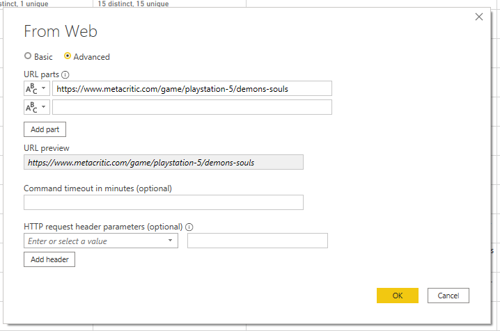
You can toggle on to the advanced tab to see all the options this connector offers. I’m connecting to a publicly available URL so I don’t need to add any kind of authentication headers (although for reference if you are connecting to an API you may need to provide authentication keys through the HTTP headers at the bottom). In this example I’ve used the URL for the Demon Souls Page.
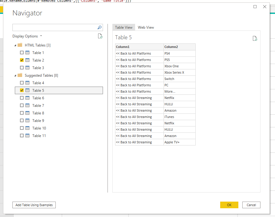
Once we click OK, PowerBI will take us to the Navigator menu. Here we can see main HTML tables as well as tables PowerBI suggests we may be interested in. If you happen to find the data you want in a preformed table then lucky you - just click the tickbox to add it and click OK to load up your preview in PowerQuery. But let’s assume you didn’t find what you needed. We can click on “Add Tables using Examples” to use this super cool feature.
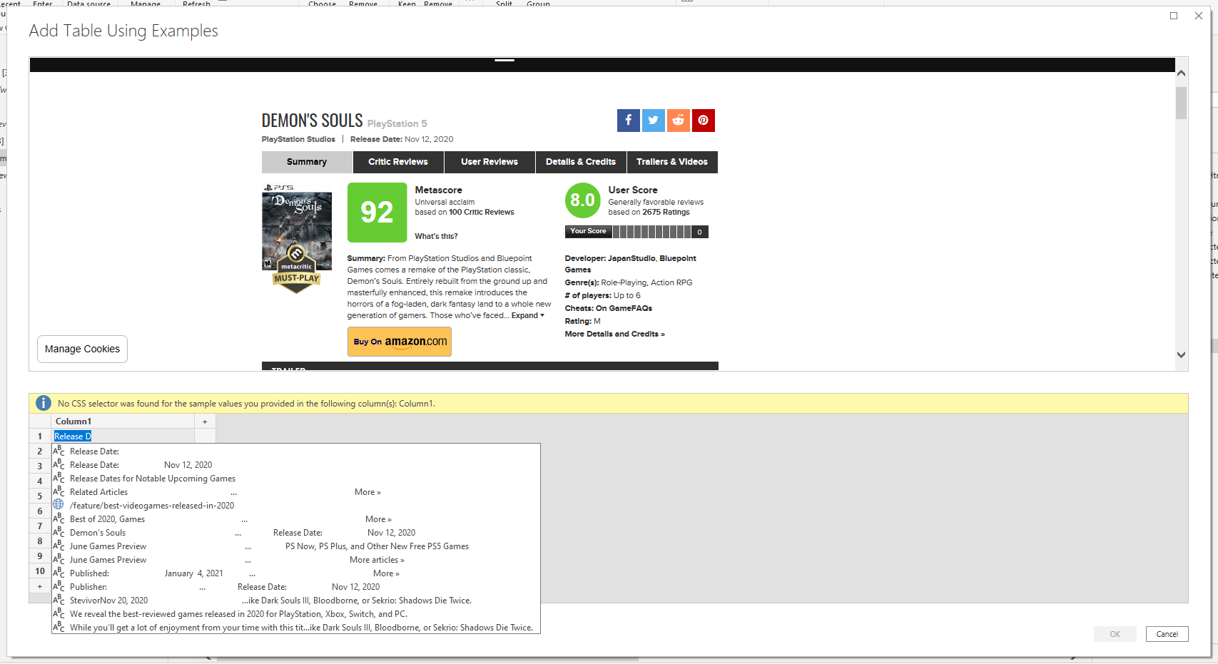
So what are you seeing here? Up top PowerBI loads a preview of the target webpage, so you can use it to find the information you want. Then in the bottom half we see our data entry point. Here you can start typing the item you are after, and PowerBI will continue to refine the search until you can find the feature you are after. This can take a little back and forth to find the bits you want. Longer strings are often quite easy to find, but the shorter snippets of text in titles and the like tend to have weird spacing and formatting.
If you have an element that is repeated on the page, then PowerBI will bring it into a single column for you. As an example, the screenshot below shows my connection to a summary page, where there are lots of different mini snippets of reviews for games. In column 1 it picked up the 1-10 rankings, column 3 it found the console associated with the ranking, so they get put on the same row and so on. In column 2 you can see one of the pitfalls of webscraping - the titles of the games don’t come through cleanly, evidently in the code behind the webpage the console and count that is appended on the end is somehow linked in to the title. This isn’t a huge deal though as we can easily tidy it up in PowerQuery.
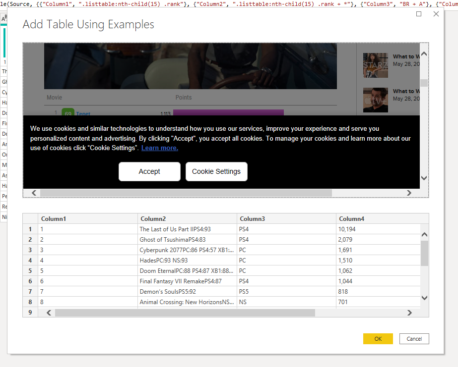
So I just continued typing in suggestions of the bits I wanted until I had managed build out my table. Once you are happy you just click OK and it’ll load the table into PowerQuery and you can do whatever transformations you need to clean it up.
I’m not going to demo the whole process because it’s quite boring, but I will run quickly through one example to give you the idea. Below we see the UserScore ratings which comes as a overall sentiment of the reviews and then tells you the number of reviews that sentiment is comprised from.

In this case I want two columns, one with the initial sentiment (although I’m happy to leave the “-based on” string as this will make my visualisations easier to make) and one with the numerical values. So I just use the Splitter.SplitTextByCharacterTransition function to tell PowerBI to split it at the first instance of a value between 0-9


However, I want my numbers to be treated as numbers so I’m going to have to get rid of the string “ Ratings” from my data, or PowerBI will only recognise it as a string value. This one is even easier as the delimiter in this case is a space, so you could split this one using the “Split Column” GUI.

Then I just removed the column of “ Ratings” and changed the datatype to an integer.
The super cool bit is now that we have put this in our code, if we decided to pull a different page PowerBI will apply the same steps. Once you’ve finished this and got the output table you want, you have essentially built a webscraping and cleaning tool, that would be able to accomodate any other page with the same structure. In this example, if I wanted to pivot my games list to films instead, because the page structure remains the same, I would just need to change my source, and this code can then run on the new page.
So this is great if we just wanted a single page. But as you saw in my example report, there are actually 15 games you can pick from. I could of course just duplicate the query and change the source URL to pull back data from each games page, do that 15 times and then I would be done. But that would take ages and not be very scalable, as if you wanted to add more, you’d need to repeat that manual process again.
So instead we will convert our query into a function and then create a looping function, so that we can just feed a column of URLs into the function and it will iteratively run the same query on everything we feed it. I’m not going to cover how to actually build your loop here, as I’ve already done that in another blog post that you can read here. But in essence you just swap the static URL for a parameter and convert it to a function. Then you source a list of the URLs you want to hit and then Add Column > Invoke Custom Function to apply your function to that list
As I did this in a bit of a rush, I just manually created this list, but for real future proofing, assuming your target URLs are easy to predict, you can actually do this programmatically. In the above screenshot, the URL are in the leftmost column and you can see they are reasonably standardised. So I could have made a spreadsheet with a list of game names and platforms and fed that in as the source, or even just entered the data into PowerBI - basically there are an unlimited number of ways you can do this! But if I passed, as an example, the game name as “Nioh 2” and the platform as “pc”, then you could write some M code to concatenate the static base URL “https://www.metacritic.com/game/” with the platform and game name (using replace values to convert a space into a -). Of course this process would be totally different for another site, but the idea is you could generate this list automatically based on user input.
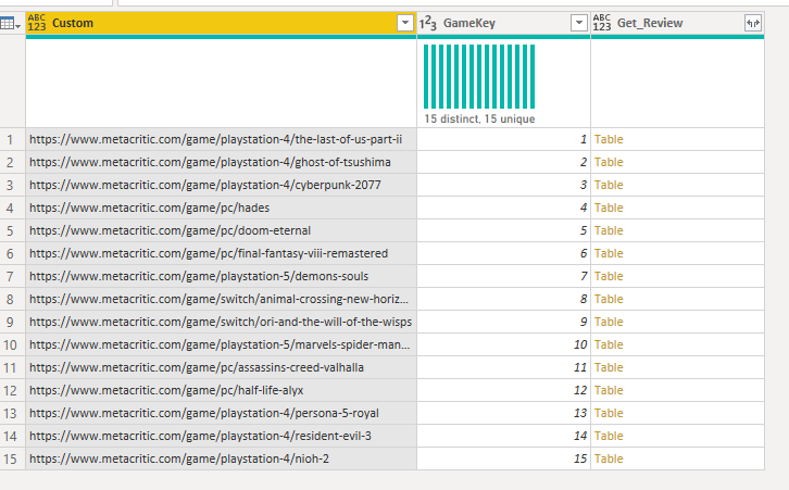
The rightmost column where we see the “table” values show us where I’ve applied my custom function. All of those tables are actual tables, containing all the data returned from the respective query. Because the output data is returned in a standard format, we can then just click the double arrow icon to expand, and it’ll automatically merge it all into a single giant table for us, as you can see below.
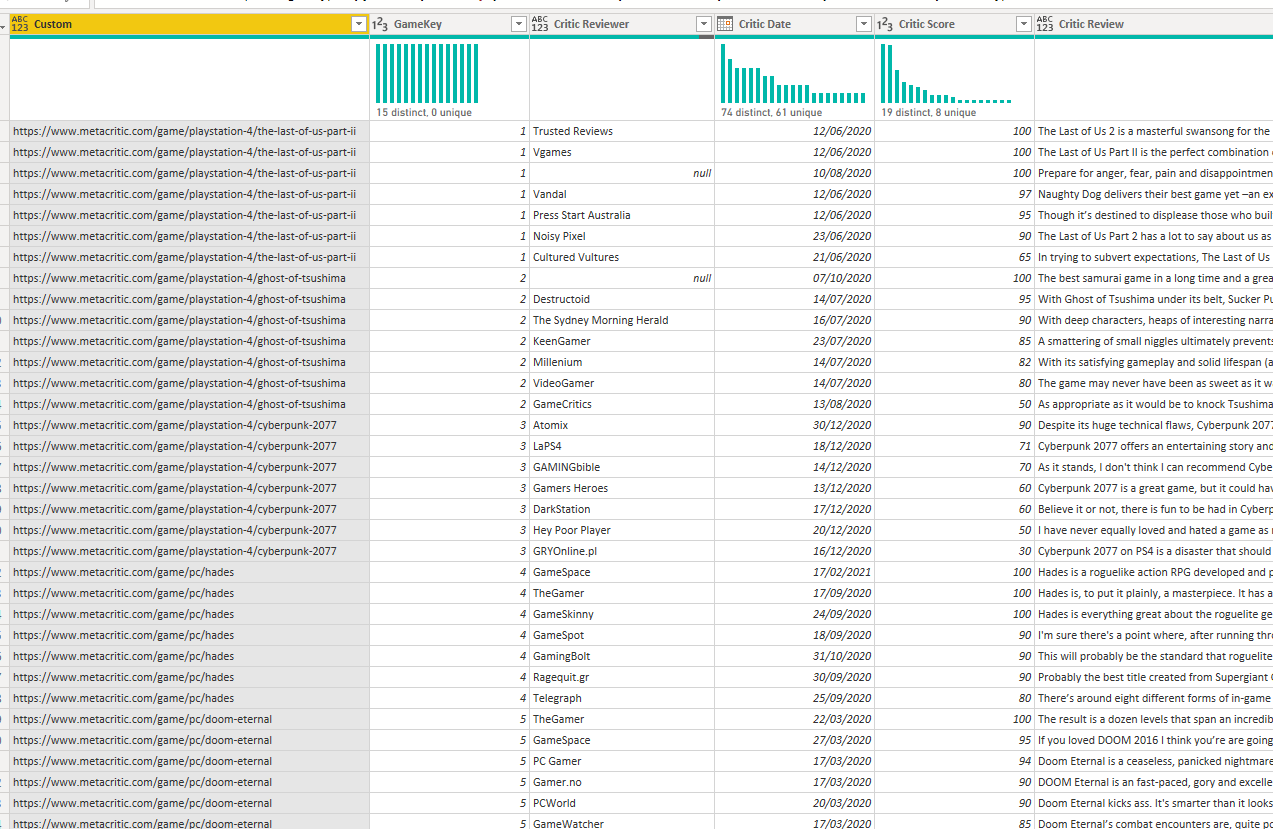
You’ll also notice in the previous screenshot, before I expanded it I had a index column. In the screenshot above you can see that gets expanded along with the table so that the last of us 2 which was (confusingly) number 1 in my index gets a 1 on every row. It’s handy to add an index column like that in before expanding as it allows you to easily make keys, that you can join tables together with later. This is because joining on a whole number is more efficient and less likely to break than matching string values, so would recommend doing this.
So I did this process twice, to get a list of all the reviews and summary. Now as both tables contain my primary key multiple times I would have to join them on a many to many relationship, which is almost never a good idea. Instead I made a little summary table that we can use as a bridge to join the two tables together with one to many relationships. Then when we apply a filter on game name using the name from the bridge, it will filter both my reviews and summary table. I also wanted to add an image for each game, so added it in here, because in either of my fact tables I would have each image URL repeated multiple times, but it would never change per game, so makes sense to store it at the game level.
And that’s it, data model built! As I mentioned, I was trying to do this quickly so it definitely isn’t a smooth or polished model, but it’ll get the job done!
Just to quickly pivot to a more serious example than my video game scraper, if you were doing a project that did need to collate data from a large number of webpages for a research project, what we’ve just built will let you automate that entire process, which could save you serious amounts of time, if you had a big project. One note of caution however, sending hundreds of calls to websites servers isn’t very polite and is actually sort of what a denial of service attack is. So if you are planning to send a lot of requests you may want to look into using the Function.InvokeAfter to limit how quickly your query will fire a request to the websites servers.
Visuals
Next up, I had to actually build the visual. I actually didn’t do anything too complicated here, but I’m now going to show you a few random tips on how to make your PowerBI report not look like a PowerBI report.
Branding

I knew I wanted to recreate Metacritic’s branding, so I literally went to the site and took some captures to use as an imported image, to give the right look and feel.

Here I’ve selected the components so you can see better how I put it together. I got a copy of metacritics logo, removed the background using the tool in PowerPoint (super useful tool!) and I also grabbed the navigation buttons from the site. If I was doing this properly I’d have had different pages for movies and TV etc., then I’d have put a blank button over the top of each one with a navigation action to the relevant page, then on each page just have a different image so the white line would underline the right item.
Search Bar
Metacritic’s search bar looks a little different to mine, for this one I used a custom visual that offers options as you type, which mimics standard internet search functionality. Unfortunately it didn’t have quite the formatting options I would need to get an exact match, but it is still pretty close!

Also has a really nice dropdown feature
Full Site Button
You may also have noticed the Full Site button. Now, obviously metacritic doesn’t have this, but I wanted to include an easy link to the actual site (mostly so I could show off while demoing it by bringing up the page of any game for comparison to my report!)
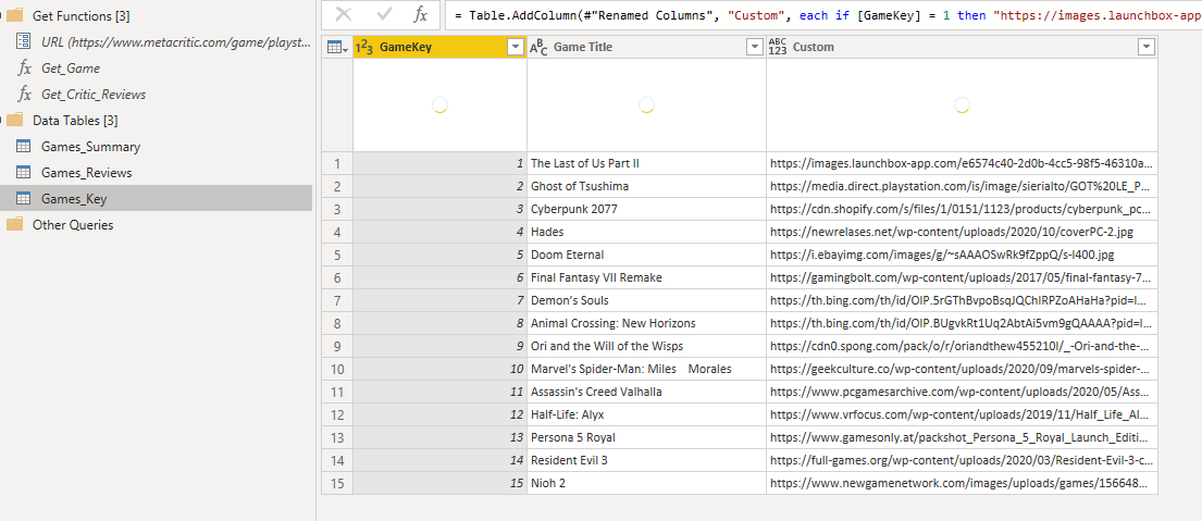
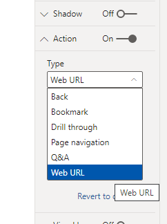
It’s actually super easy to do this, because we already have the URL to the page in our data, as that is what we fed into the API. As we have the URL per game, when a user filters the report to a single game they are also filtering all the URLs down to just the one relevant to the game being viewed. This means we can add a button and set the action to be Web URL

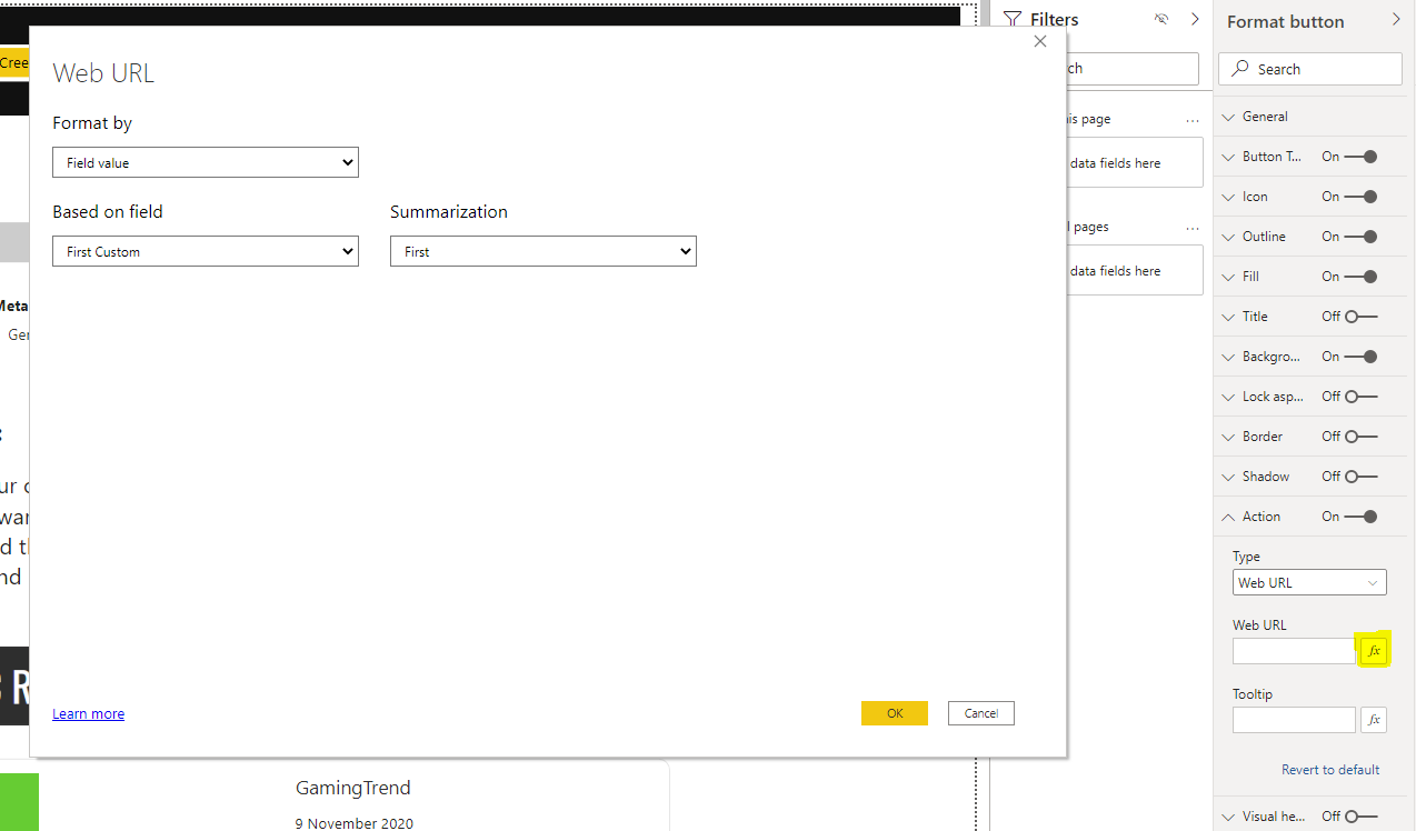
In the third screenshot I’ve highlighted the button to press to get to create a formula for the Web URL - using this we can make the button dynamically change where it will take you to based on the user filter. In this case I’ve just set it to use the first value in my “custom” column (lazily didn’t rename it). As the slicer will filter the URL list, I know there will only ever be one value for it to use which will be the URL of the game currently being viewed.
Thumbnail
My version is on the left, and the real site is on the right. Pleasingly mine actually rendered better, although I did zoom in a bit on metacritic, to be fair.

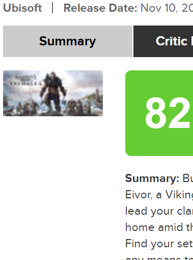
The eagle eyed among you will notice that the score is different between the images - I didn’t set my data to refresh and someone posted a less favourable review since I made this report, so Assassins creed is now one point less good. Poor old Eivor.
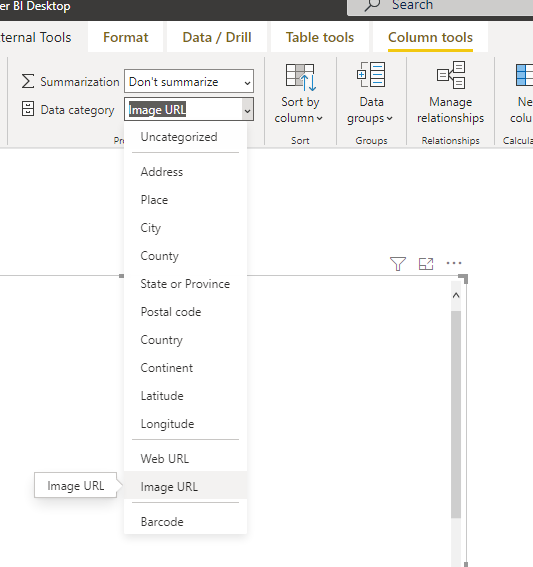
My visual is displaying image URLs. In standard PowerBI visuals these are not brilliant. However, youcan show them as images in tables and there is a little trick to help with that. Firstly you need to set the Image URLs in your data to the Image URL category in the column tools tab. Then put them in a table and it’ll display the image. The problem is they are really small!
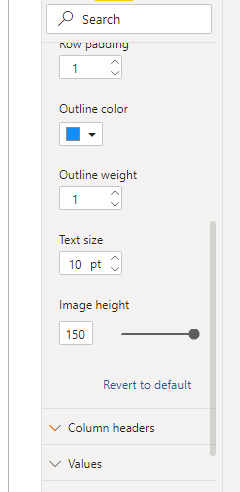
There is a setting that helps a bit, but it’s quite hidden away. You need to select the table then go to the formatting menu and go to Grid and scroll all the way down and there is an image height slider. If you set that to the maximum, the images actually become an OK size.
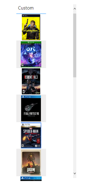


I opted for a custom visual instead though. There are a couple on AppSource, although none of them are amazing to be honest.
Reviews
The last thing I wanted to add was the review snippets just like you see on the real site. I knew this bit would be a little bit manual. I was half tempted to bring in a PowerApp to use the gallery visual because it has that perfect iterative layout of your data, where it can output as many items as you have, but that felt like overkill. Unfortunately, there isn’t an equivalent visual in PowerBI. I suppose there might be something you could do with small multiples, but my other challenge was to keep the formatting as close to the source as possible, so building them inside a visual would have been challenging.

Instead what you are seeing is the frankly brilliant advance card custom visual, using custom formatting to colour code the reviews, a couple of cards for the reviewer, date and review snippet.
On the site there are normally several of these lined up. To achieve the same effect, I added an extra index into my underlying data, that repeats itself per game, per row in the reviewer table. You can see this in the Index column, where it iterates from 0 to 6.
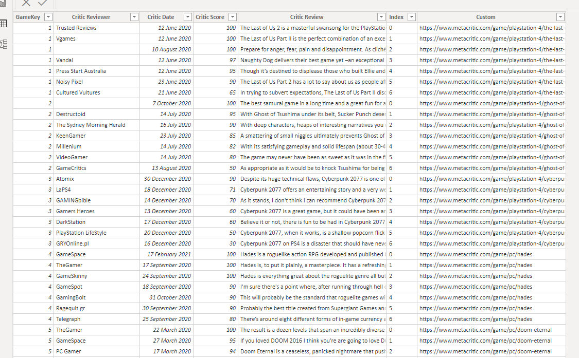
These numbers are essentially recording the reviews position on the page, so review 0 is the first one and review 1 is below it etc., this has the nice effect of ensuring the ordering remains consistent with the source. It also means I could duplicate the visual cluster I made 6 more times, then just set the visuals to be filtered to the index number based on their position.
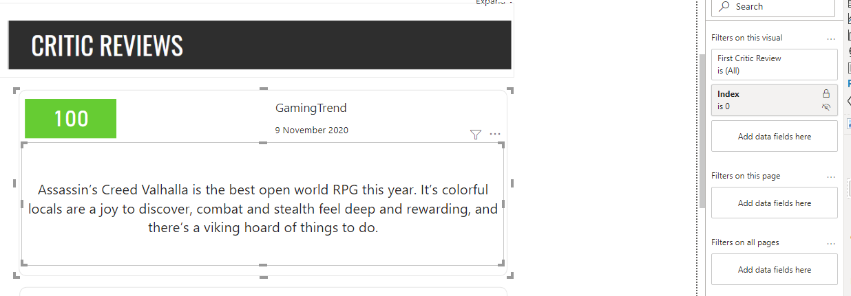
This way, as users change the games, PowerBI can output all seven reviews available in the order of the source.
And there you have it! Today we looked at webscraping, writing loops and a bonus bit of design in there as well - quite a big one! As ever if you have any questions feel free to reach out to me through the contact page (several people have messaged me through this now and it’s great getting your messages!) or comment below.
If you want to look at the report again with a newfound sense of awe after seeing how it was made (I probably should have had it at the bottom to keep you engaged, instead of giving it away right at the start…) you can click here to view it on the native PowerBI page, where it is a bit more impressive!
Finally, I thought I went an entire blog without mentioning Sherlock, so here is a throwback photo of him as as a puppy doing his best impression of Sif, the great grey wolf from Dark Souls (which is loosely related to demon souls that was mentioned in this blog, so technically, this counts as relevant!). I think he nailed it.