Self Service Analytics: The Practical
Hi everyone!
This is part 2 of my blog on self-service analytics. In this post we’ll be looking at how we can implement some of the principles of self service analytics into an example sales report - I’ve used PowerBI, as there are some really great features to help this effort, but these principles apply equally to all visualisation softwares - although it may be harder to implement in some!
If you haven’t read part 1, it covers the theory, and pros and cons of a self service approach and you can read it here. It’s not required reading though - so if you just want some tips on how to build a more self service focused report - let’s jump right in.
Firstly, I’ve built a simple sales report, using standard guided analysis principles. This sales report is for my dog Sherlock’s (fictional) online retail business. You can interact with the report below (I’d recommend going fullscreen).
We have some key figures up at the top, to provide at a glance headline figures - in keeping with standard UX best practice. We also have some analytics - how many of each item have we sold (Try the interactive tooltips on that chart - these products are real and completely wild - the sleep at work stickers might be my favourite), our revenue and profit over the month and the split in sales between our sales staff (I used RANDBETWEEN to generate these sales - very irritating Sherlock beat me!).
Anyway - thats your basic report - nothing too fancy. It gives a good overview and does allow for some drilling down - cross-filtering is enabled so some analysis can be done. But that is about the limit. If somebody wanted to dig a little deeper, they would have to go back to the developer and ask for the new features. But I’ve already built this once, I don’t want to spend a bunch of time on small changes. So let’s add a bit more of a self service element.
One great feature we can use to kick this off is the relatively new personalise visuals feature, which came into preview April 2020 (if you want to use this, remember to turn it on in preview features first). I’m not going to cover how you can set this up (if you want some instructions this is the Microsoft documentation).
Once you’ve set it up, it will allow you end-users to make their own changes to your report. These are temporary and won’t affect what any other report user can see. Also, there is a helpful “Reset” arrow, so if a user goes to far, they can always return to the original visual you set up.
Let’s say we have a client who doesn’t like bar charts, and instead prefers bright colours and shapes. Instead of having to remake the report for this user, they can simply click the personalise visual icon and will be able to change the visual to this horrible treemap -

These changes don’t persist, but you can tell your user to save the report they have modified using a personal bookmark. That way, when they view the report again they can quickly switch to the view they are more comfortable with.
Also worth noting, the visuals for a user to select from are all the visuals in your report - so if you have any custom visuals, those would be available to your user too.
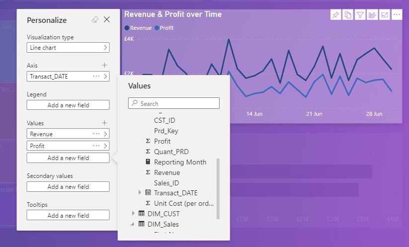
That isn’t all. Depending on the visual (hopefully more visuals will support the full personalisation experience as it matures) you can also swap in different measures / variables! Here we can see our line chart presents these additional options - all of the fields we would see in the desktop are exposed to have new variables added - instead of having to rebuild the report to include an extra element on this chart, our end user can simply put it in themselves.
But this raises a issue. You can see in that menu my data tables are pretty unfriendly. Lots of weird abbreviations give it a distinctly back-end feel. Let’s take a closer look at the data model
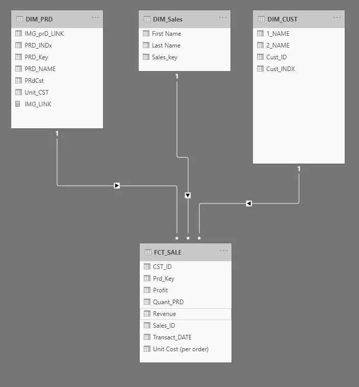
We have three dimension tables and a fact, named with abbreviations - I think this is a pretty common practice. Then in our measures we see delightfully unhelpful terms like “PRdCst” and “QuantPRD” - you could probably take a guess at these meanings, but it’s certainly not immediately obvious. We also have similarly named measures like “First Name” and “1_NAME".
This sort of thing might be OK for our developers, but for a non-technical person, this could seem pretty confusing, and could be a barrier to people using this feature. Not what we want.
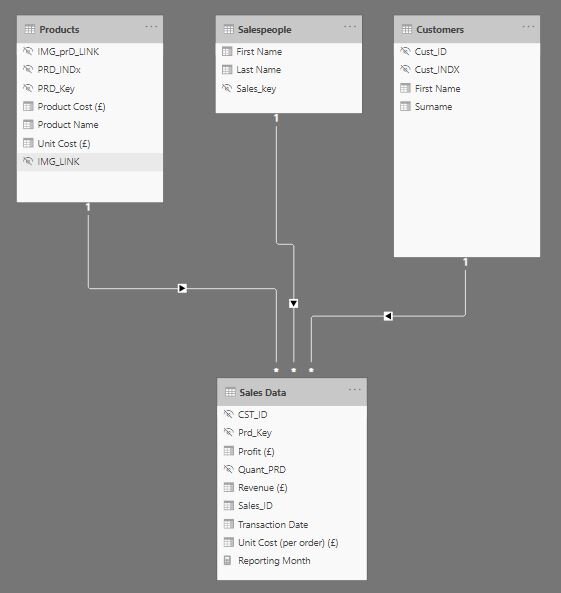
In traditional guided analytics, users tend not to see the underlying technical names, and I’m sure we are all guilty of leaving it a bit messy. But with self service we are throwing back the curtain into our model, so it probably needs a bit of cleaning up:
So what have we done?
Lots of the data is for the purpose of linking the tables (i.e. Product keys, Customer keys etc.). We don’t need to rename that background stuff, because we don’t actually ever want to give this to our end users - there is no way it would ever benefit them to know the technical key. They stay in our data to allow our model to operate, but we can simply hide them - any column or measure that is hidden in report view won’t show up in the personalise visuals feature.
For columns / measures we do want to expose, they have been renamed to more human friendly terms. PowerBI doesn’t care if your names have spaces in, so drop the underscores and abbreviations. In some cases it may also be helpful to include units in the name, as this will populate onto chart titles automatically, which can help improve the UX.
The table names have also been renamed into something friendlier - if you are unfamiliar with concept of fact and dimension tables, those abbreviations (FCT and DIM) won’t mean much to you.
So that cleaned up what we had. Is there any way we could make it more user friendly? We still have potential confusion with names - and it’s probably more helpful to have the full name as a single variable anyway.
Also, we can create a dedicated table to store our calculations. If you want to make a calculation table you can just “Enter Data” and save a blank table, calling it something like calculations (bearing in mind calling it a measures table may not be accessible to people unfamiliar with PowerBI terminology). Then in the model view, change your measures home table to your new calculation table. Unlike a calculated column, a measure merely references one (or more!) tables, and therefore can be stored in any table without issue.
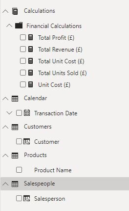
You’ll also notice that little folder icon. In the Model view, when you select a measure you can also change it’s display folder (which will create a new folder if you enter a name of a folder that doesn’t already exist). Obviously in this model it’s a bit overkill as we only have a few measures. But it is good practice to do anyway, as it can help keep your model organised.
Imagine you had 3 fact tables - your end users may not appreciate the difference and be confused as to why certain measures are only in one table. This way you can have all of your measures accessible in one place, and neatly organised. This would also be helpful if we had lots of measures for different profit, revenue and quantity sold calculations - grouping them into folders can make navigation much easier!
You’ll also notice I’ve hidden all the underlying columns in favour of using measures. Again, not super necessary for this really basic dataset, but using measures instead of the raw columns is a good idea. Firstly it allows more control in aggregations (for example if you had data with people’s ages, AVERAGE is probably a much more useful aggregation than SUM) as you can specify that aggregation explicitly, instead of leaving it to your users to guess. Also, it allows us to hide all the underlying columns - now we just have one table with our facts in (Calculations) and all the other tables are simply for dimensions, rather than having a couple facts dotted around our model. You’ll also notice I renamed our primary fact table to “Calendar”, which may seem a bit weird, but actually the only value we want to expose from it is the date, so it is basically serving as a calendar. Of course, most PBI reports have a dedicated calendar table - if you had that you could hide the fact table entirely.
Now the model is tidied up our users will be able to easily understand each variable and use it to drive their own investigations into the data.
Onto another cool feature - Q&A visual. This visual is now a standard PowerBI visual and as such doesn’t need to be enabled. In fact, double-clicking anywhere on a report page in the desktop will create a Q&A visual, I assume as an effort by Microsoft to make you notice it!

So what is it? The basic visual is a search bar, and some suggestions.
The Q&A visual allows a user to ask a natural language question, and get a answer to a data question in the form of a visual. The model is also designed to improve over time as users interact with it. As a developer you can view all the questions that have been asked, define terms that it didn’t understand and also set synonyms. As an example, in the request to “how much money did we make last month” PowerBI can only use the data present in your model to answer the question. None of our fields have the term money in, so it wouldn’t know how to answer that question. As a developer you can tell it to treat money as a synonym for total revenue, and the next time a user asks that question, PowerBI will understand what the user wants to see.
The Q&A visual as a topic is quite deep, and we won’t go into it fully here (although again, here is the documentation if you are interested) but I will give you a few quick tips.
You can directly format the Q&A visual itself, but you can’t directly control the formatting on the visuals it creates. These will always be generated in accordance with the theme you have set - if you want to change the colour of the text on an axis for example, you will need to modify your theme.
PowerBI need a clean dataset to work with, to help it process the questions better. Renaming your data to more human friendly terms will help, as people are far more likely to search using terms that are natural to them.
In the options of the visual you can “Teach Q&A”. Here you can ask questions and it will provide you the answer it thinks you are looking for. By running a few of the more obvious questions through this before giving it to your users, you’ll create a better initial impression.
PowerBI will give you some recommended questions - but you can set these manually which is good if you know certain questions are likely to come up frequently.
Just a final sneaky tip - the questions PowerBI suggests by default are only questions it can answer, so they are a pretty safe bet in a live demo!
All done:

This is the bit where I’d love to give you an interactive demo, unfortunately it seems neither the Q&A visual, nor the personalise visual feature is supported when I publish the PBIX to web, to share it out. However, if you are interested contact me / comment below and I can give you the pbix, if you want to play around with it. Sorry about that, but here are some GIFs of it in action:

I really like the Sleep at work stickers.

Here we can see how user can change a visual to answer their questions and then revert to original
So there we go - guided analytics to self service.
You may have noticed those headline values in the cards at the top of the report didn’t get changed. This is because while we could just give a client one big visual and let them do all the work, it is a fair bet that our user will always want to see those headline values. This blog isn’t here to advocate throwing away all the features of guided analytics - for those kind of quick, always valuable, figures it just makes sense to keep them front and centre - but once our user has got those figures, it’s about giving them the tools to go deeper and answer some more advanced questions themselves. In doing so, it will make them think about their data in new ways, and help questions arise that otherwise wouldn’t - and this is the key to helping a client unlock the true value in their data.